Derwent Living / Pfp group (2017-21)
One bespoke CMS, many websites replaced and projects added
Design: Steve Atkin
 Steve Atkin
We can now say that this is our award-winning website, as it won a national TPAS award in 2019, as well as Compliance Plus for Customer Service Excellence in 2018.
Contents
Stage one: the application system
Derwent Living were looking to update their customer application process. An old site that I'd written previously was available for some types of customer, but also a lot still being done on paper which meant that any errors on the form could take days of sending the form back in the post, the customer updating it, sending it back in, and repeat until it was finally completed.
They also wanted to tie it in to a property advertising pages, so that people could be assigned (and eventually choose) a property and see all of the particulars including photography. I'd already written something to edit and display properties, but was being used to insert content into the existing Wordpress-based main website. Any new version had to allow for both.
Due to previous delays there was a certain amount of hurry-up involved, so I decided to build the site on the bones of a new content management system (CMS) I was writing. This would give me a head start with things like user accounts, security, and page layout templates with mobile-friendly styling already in place. It also allowed simple pages to be created for instructions, privacy policies and so on.
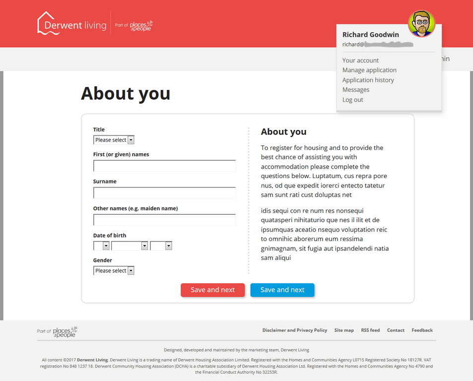
This version of the site went live late 2017. It was simple to use, but allowed staff to view partly-completed forms and any uploaded documentary evidence to help people immediately over the 'phone. The application could then be approved, sent back or rejected, with the applicant notified immediately. This resulted in a huge saving in staff time.
Sites and projects replaced so far:
- Applications
- Property site, including editor
Stage two: "everything else"
 Steve Atkin
As the site was based on the new CMS, and the main website was at least 7 years old, the obvious question was, why not update the website? Followed quickly by, and why not all the other websites while we're at it?
The first step was completing the CMS to handle more varied content (web pages, news and magazine articles, alerts, events, even redirects to move people from outdated links to the right place), with post-processing to handle things like embedded forms and maps. Being able to add simple placeholder codes into the editor, and have these be interpreted before display, is not a new idea (e.g. bbcode or shortcodes) but greatly enhances what you can make the site do without having to train content creators in web design, and these particular placeholders show up in the editor as illustrated blocks.
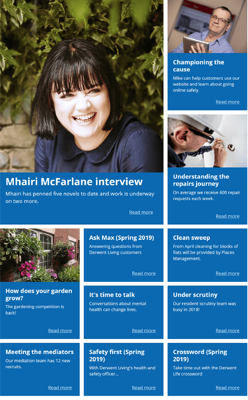
This tech lead to the creation of "content collections", like galleries for articles - grouping articles and embedding them in a page from inside the article editor. These blocks of featured articles could be put anywhere on the page, as easily as adding an image. Individual articles in the collection can be added, removed, or moved around using a drag-able interface. And with 15 different layouts, from image-lead "magazine" layouts and card blocks to simple text boxes or bullet lists, there's no lack of variety.
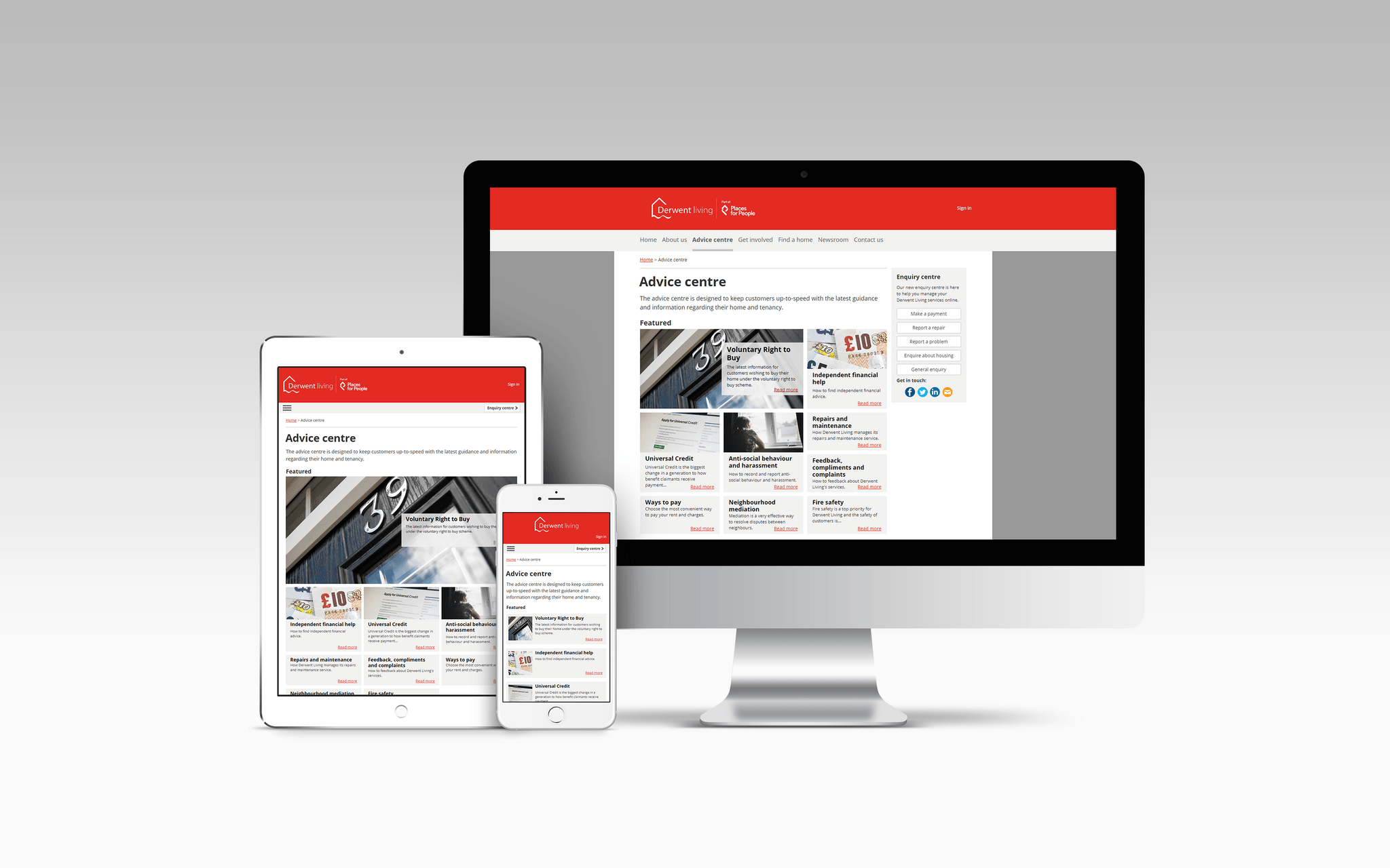
This enabled a flat, mobile-friendly navigation where instead of trying to use menus and sub-menus to move around, the user jumps straight to helpful pages; which in turn lead to switching from the previous list of services and how to use them into a self-help "advice centre". This has featured articles at the top, which can point people to the most important articles, or allow quick reaction to events (e.g. cold weather advice being pushed to the top in winter). After a section of cards linking to content based on customer type (rental, retirement, sales etc. - replacing and improving on a separate "welcome to your new home" website) there's an alphabetical text-only list, and then a block displaying the latest magazine articles. Then when reading an article the same tech pushes "articles in this section" into the side bar, the number and layout of which is dictated by the amount of available space.
In what we're told is a first in Europe, forms were engineered to tap in to the company's contact management system to cut down the overhead of receiving emails from the site and having to manually copy them over. And by using the messaging system on the site (designed to update applicants about application errors or status changes), copies of messages sent, along with contact references, get saved for future reference.
All of the content from the old site had to be evaluated, re-written and new imagery added, which, with the improvements to the editor over the old intranet, meant that someone else (mostly Steve!) could handle that.
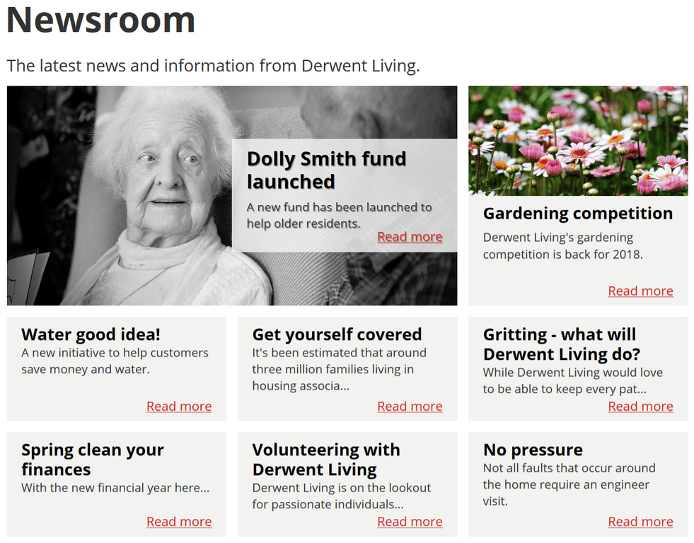
And once the main site was replaced came the job of updating or replacing everything else. The property area, freed from having to lay out content so that it could be injected into a WordPress site, was completely overhauled, with a more pleasing layout and a suite of filters so people can more easily find properties based on size, location and/or tenure type. The customer portal was completely replaced by a tenant account section, and the customer forum replaced with a "get involved" section with an events calendar and community articles with commenting and emojis.
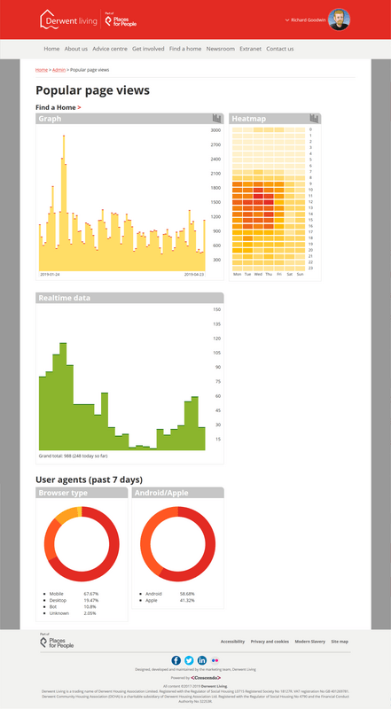
The CMS even meant the removal of the publications area as a dumping ground for PDFs. Instead everything is created as a proper article, which can be read immediately on any device (and it makes it easier to search for or print). Even magazines were converted into full collections of articles, with a distinctive blue collection backgrounds. With proper social media integration (adding sharing tools and full metadata to improve the quality of embedded content) it's now much easier to share either an individual article or a whole magazine online.
A "message of the day" section on the home page allows little notifications and advice to pop up, depending on the day. For instance during the week it has several messages it displays at random, except on Mondays when 'phone lines are traditionally busy it points people to the self help section. At the weekend it displays out-of-hours repair contact details. This can be replaced by announcements, which can be written in advance then appear and vanish at the right time automatically - so bank holiday closure warnings for the entire year can be added in January and forgotten about.
After the dust settled, we realised we no longer needed a separate Android and iOS application, so the app was put out to pasture too.
Sites and projects replaced so far:
- Applications
- Property site (twice!)
- Main website
- Welcome site
- Customer portal
- Customer forum
- The App
Stage three: extranet
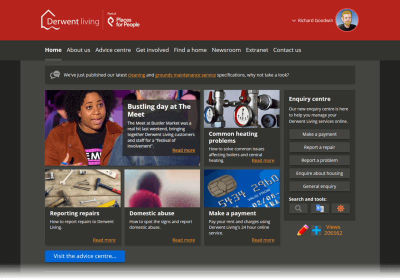
After adding search and Google translate to the site (and then a cool dark mode theme!) we were asked to look in to replacing the out of hours handbook - a lever arch file of collected information that people on call needed to keep close. Could this be replaced by something that they could call up on their 'phone or laptop? Too right it could!
While building the handbook functionality I created an extranet for other types of staff articles, and also added disaster recover article types. This removed another website, and meant the last WordPress install was finally off the server.

After some more fine tuning of the server, the site ran extremely fast and even with high resolution images used by default, the image compression techniques I use meant that the whole front page was less than three quarters of a megabyte in size.
Possible expansion
Next steps included using the data from the site to power other systems. We were attempting to put together a touch screen version of the site for a test in a retirement scheme - a large TV with a web browser (Raspberry Pi powered?) to show targeted information in a large format. Finding large, cheap, touchscreen TVs that were robust and theft-proof enough to be used in public proved more difficult than the code however.
And the original part of the project - the application system - was based on an old survey platform I'd hacked together in less than a week and re-used on multiple occassions. Although another simple survey editor existed to send single questions to mobile users, it would have been nice to put a proper creation interface on the full survey platform and fold it into the main system.
Actual expansion: Chorus Homes
Once the Derwent site started getting attention, it was realised that other companies in the group could benefit from similar upgrades. I was seconded to Derwent stablemate Chorus Homes in Cambridgshire, although working from home and hosting was provided by Derwent in Derby.
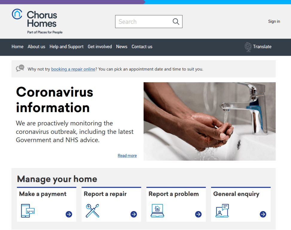
This was no mere reskin; as the first stage only required a new website with better content organisation and emailed enquiries, we instead moved to my more advanced codebase that I'd been working on for my own site (this one!) but with layout and user accounts more in line with Derwent's site. This change added more editing features, the minor pain points on the original site informing quality of life improvements here. The new site also required all content to be spidered from the existing Chorus site, extensively re-written and re-organised, then redirects put in place so that all the old page addresses still worked.
The project hit its deadline despite COVID - perhaps because I was already working from home, we were in a better place to switch to completely remote working. However, the decision to launch was delayed, which impacted later stages of the project. The addition of user accounts was the priority, with the ability to view rent accounts and manage repairs. A new repairs API that tied directly to back-end systems was implemented but never put live due to exsiting stresses on the repairs system.